6.28.2009

"O Percutor Harmonico" by André Lemos (review)


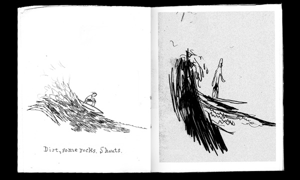
Based on Sergio Leone's 1968 Western Once Upon a Time in the West and drawn in André Lemos' characteristic heavy-brush style, O Percutor Harmonico is a sort of translation of the opening scene of the film, though not at all a straight re-telling. There are no words - in the art alone Lemos skates on the surface of Leone's work, picking and plucking and placing images in an order that creates something new alongside the original story.


O Percutor Harmonico opens with a Lemos version of the Paramount logo making it clear that he's drawing from a film. Once Upon a Time in the West is famous for being full of references to other Westerns so it works well that Lemos is choosing his own motifs and references to play with. A train, dusters, a windmill and of course, cowboy hats. There's also, just once, a harmonica, something very important to the original film.


This way of translation reminds me of a song by "Mole" called "Monument Valley. The lyrics are lines pulled from (I think) John Ford's classic Western Fort Apache, but they are similarly plucked and reshaped to make something that is certainly of the original piece but something wholly new as well.


Lemos' art fits the gritty dirty subject well with his careening violent brushwork. The images don't clearly or easily tell the story, but they add up anyway. There's a slim thread of a narrative (a train arrives, some guys face off, a gunfight), but Lemos doesn't open a window for us to gape though - he re-edits the film in ways that don't always seem to make sense and gives us an experience that we find, one that we piece together. This is close to an Eisensteinian way of making comics - drawing not only from film's more obvious narrative capacity but also from it's mysterious juxtaposing power.


I'm not sure how one could get O Percutor Harmonico other than to email Lemos directly though his Opuntia Books site. Here's a review by Portuguese critic Pedro Moura. O Percutor Harmonico is published by AO Norte. All these sites are in Portuguese. I should add that since I can't read Portuguese, and the essay in the book is in Portuguese, I may be missing something critical about the whole project. I like being confused though, so this language barrier has not been a problem for me.

All images © André Lemos. "Monument Valley" is © Mole - if you are Mole and want me to take it down I will but I couldn't find you online anywhere to ask permission. I hope you're ok with me spreading your glory.
6.25.2009

more Seed Toss updates


More postcards up here. I'm still back in ancient territory - these cards are from 2002! I'm still doing them though, so send me a mailing address if you want one.

6.18.2009

Crabapple by Franklin Einspruch (review)


Crabapple, like many of Franklin Einspruch's other webcomics at themoonfellonme.com, is a sort of haiku - a freshly observed moment that unfolds and unfolds. He is a painter and it shows in both the beautiful handling of watercolor (the lively lines, the careful blending of colors, the spontaneously precise rendering) and in the observations the pieces are about. He sees things but finds them by making.

What isn't expected is his startling ways of making these images and words into comics. He is frequently subtle and sneaky in how he makes the pictures underscore the text and vice versa. In Crabapple, the first image is of a brown, almost crispy bush. No background, a line of brown (maybe dead rotten brown or maybe soil, sleeping, maybe waiting).


In the next image: the bush again, still brown but with green leaves, pink blossoms and a green carpet underneath. What amazes is the sky - this tree has blue sky all around and through it. The first tree was alone, separate, dead but this one is alive, penetrated and one with the world.


The final images in the piece, two similar pictures of flowers and leaves on branches take this theme further. The color of the leaves bleeds into the branch marking them as un-separate, as one. (The images I'm presenting here are out of context - the actual piece has a lovely side-scrolling motion, revealing itself as you look.)


His lettering also adds to the effect. In the first (all brown) text area the break of "down" where its ascender reaches up for the descender in the "P" of "pull" mirrors the image of the maybe-dead bush. The next text, after that beautiful tree image, is blue like the sky. The final text is green like the sprouted leaves.


This piece, like many others he has made, has such fresh observations and thoughtful, subtle ways of finding the world by making, is the best apology he could give.

All images © Franklin Einspruch

6.17.2009

Seed Toss updates


Updates over at Seed Toss - more postcards and some street art from out San Diego trip.

NASCAR #5 paint scheme (review)


Over at Rowdy.com I posted a review of Mark Martin's #5 paint scheme. Yes, it's NASCAR!

6.14.2009

Or Else 3 by K. Huizenga (review)


This book is a mix of new work and stories reprinted from earlier comics but somehow Huizenga makes them all seem parts of a whole. Part of this could be the craft - his drawings match his writing - seemingly casual but very careful and precise. It's easy to look at and read his work but he always keeps something there that doesn't allow a reader to merely skim by. In this book there's what seems to be standard slice-of-life poignant comics - his elderly neighbors, his mom's disease recurrence. We've read things like these before, but Huizenga adds something more, something that overarches all the stories in the book, something that ties together these seemingly disparate stories. He makes the non-fiction feel like fiction: artificial, non-mimetic and, somehow, more real.


I think the key is in an adaptation of an excerpt from Franz Kafka's diary where Huizenga draws a man encountering strange things on the street. The man seems amazed by it all, but separate from it, removed. He say to himself while watching two men fight "Stop fighting, gentleman." Huizenga repeats this panel later in the book, having the man and then a cartoon animal both say it. It's a thin strand but it seems to be a tiny fiber of a poem woven through the stories - "Stop fighting, gentlemen." The dying neighbor, the sick mother, the soul-sucking job: "Stop fighting, gentlemen."


PS I read this book in a crowded mini-van while being shuttled from home to my car which had been serviced. On a multi-lane sprawl street we all heard the droning monotone of some weird song from a car stuck next to us in traffic. One lady next to me giggled, then I did. I looked back down to the book and thought, "I should draw that in Huizenga's style."


6.06.2009

Black Cat Skate show


I didn't blog this yet... Last December I had a piece in the "Broken Boards" show at Black Cat Skateshop here in Charlottsville. Andy, the owner, gave out broken skate decks and a bunch of folks made some art with them. Here's mine:


and some details:


I took the deck, painted it with thick gloppy house paint and then drew on it (and taped some stuff too).

Violet made one too:


Yes, that's pink paint, glitter and a pipe cleaner. So punk rock. Here's hers on the wall:


and the proud artist at the opening (and no, she didn't get any of the PBR Andy had for the party):


Oh, and here's mine on the wall:


I'm sorry I didn't get any shots of Sean Samoheyl's great piece all made from cardboard! There were lots of good things in this show... It's funny - I don't ride this kind of skateboard anymore - I have a, Earthwing SuperGlider longboard and a Gravity Ben Wei mini, both for hills and hard carving - what my old pal Marc always called "landsurfing."